
 |
| V in Brody |
One of the really fun parts of being an indie author is cover design. Since I write full-length novels, I do not get to have this fun very often. I’ve done some covers myself but for my next release, Vain, I am having one designed by Rae Monet. While choosing pictures and colors has been awesome (Rae had it almost perfect on the first draft) I have learned that I am pretty particular when it comes to fonts and maybe even more so with this book because my characters would notice a bad design choice.
Font is just as important in setting an reader’s expectation for setting and tone as pictures (or at least this is what I tell myself as I am poring over font websites). On top of that, some fonts are just not very friendly to certain letters of the alphabet.
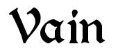
Take for example, the capital V. I have learned, since my book is called Vain, that font designers do some crazy stuff to that letter. Look at the V to the left in a font called Brody. I’ve found that many “gothic” fonts make V look like D.
 |
| V in Bordeaux Roman Bold |
Then there is the other end of the spectrum, the slender V to the right. It is lovely in its anorexic super model sort of way. Except that on a thumbnail-sized cover image it will look like a black slash or maybe an I.
Anyway, Rae Monet was very patient with my pickiness, finally turning me loose on a great site called dafont. You select a font then type in your word to see what it will look like! And that is how I found a V that I think works for a story set in 839 France. Tidy hand-lettering, doesn’t suggest witches or vampires, readable even on a postage stamp, a little curvy for romance.
Ta Da!
 |
| Vain in Augusta font |
Coming in March!
Until then, I hope you’ll check out my other historical romances in this series, Unbidden and Redeemed, that are linked all over this blog and also available as a Romance Bundle.


Cool! Thanks for the link Jill. I had a time finding font for Loving Leonardo and the Witchy Wolf and the Wendigo. This will help for the next.
Rose
Isn’t it great when you find the font that feels right? Thanks for stopping by, Rose.
This comment has been removed by the author.